Newspaper Design
I first got to experience the world of design through newspaper as a freshman. I learned the basics of Adobe InDesign and have worked to strengthen my skills with this software since by choosing sessions to attend at national conferences based on InDesign tips and tricks, as well as researching YouTube how-to's and taking advantage of my graphic designer dad's knowledge.
Most Recent Newspaper Design
|
|
|
This year my fellow editors in chief and I redid the newspaper standing elements from fonts to headers to bylines. This was the first time these were redone for many years. We switched from a conventional newspaper sizing to a tabloid size my junior year, so we wanted the newspaper to have a more modern look to go along with this change.
We chose fonts and standing elements to coincide with our yearbook design choices as we produce both publications.
I have seen my design shift from my freshmen to senior years and along with this shift have started to enjoy design more and more as I have learned. I hope to go into a career in the media and graphic design field after college and get the opportunity to strengthen my skills and learn new software.
Design from Past Years
|
|
|
|
|
|
|
Yearbook Design
|
I did not choose the task of being on the yearbook staff, but when our staff's converged after COVID, I realized that this could be my avenue to gain more design experience. I quickly emerged myself in learned what it means to put together a yearbook. Since then, I have put together two yearbooks as an editor.
Last year, we thankfully had guidance from JEA President Sarah Nichols where we spent many Zoom meetings going over what it means to think through a yearbook theme. Our theme last year became "It Just Feels Different" after I made a comment in a meeting about how school culture felt coming back in-person from two years online. I then for the first time got to make design choices such as choosing fonts and colors. Many months and late nights in the newsroom after these decisions, we got to see our thought process come through in the physical form of a book in May which was one of the coolest experiences. I realized I had been a part of creating something that will last years on end. |


|
2021-22 TAJ Design:
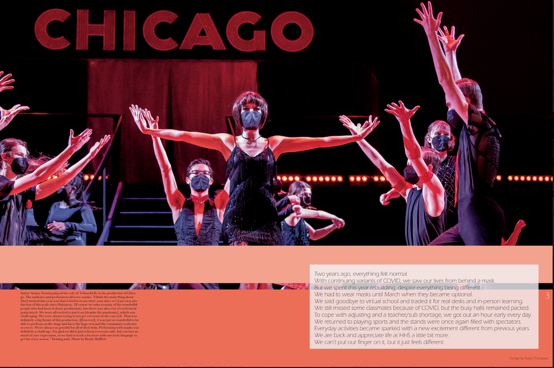
In the opening and closing spreads of the book, we spent a lot of time thoughtfully explaining our intent behind the theme for the year. We didn't want to focus on the negatives, but tell the stories of the positives and at least being able to be back together in person again. We felt that it was important to highlight the differences in high school life after such a life changing event occurred. To do this, we covered academics and sports in their new form, whether that be required masking or only outdoor practices. We additionally wanted to highlight individual student's stories with a year apart under our belt, people had changed and we wanted to provide a space to share those stories in the yearbook. Whether it was newly discovered passions, life changes or a style evolution, we covered it all.
|

|


|


|
Creating the 2022-23 TAJ
|
This year, with junior year's experience under my belt, we started planning over the summer during our summer workshop. We had our cover, color palette and fonts picked out before the first day of school.
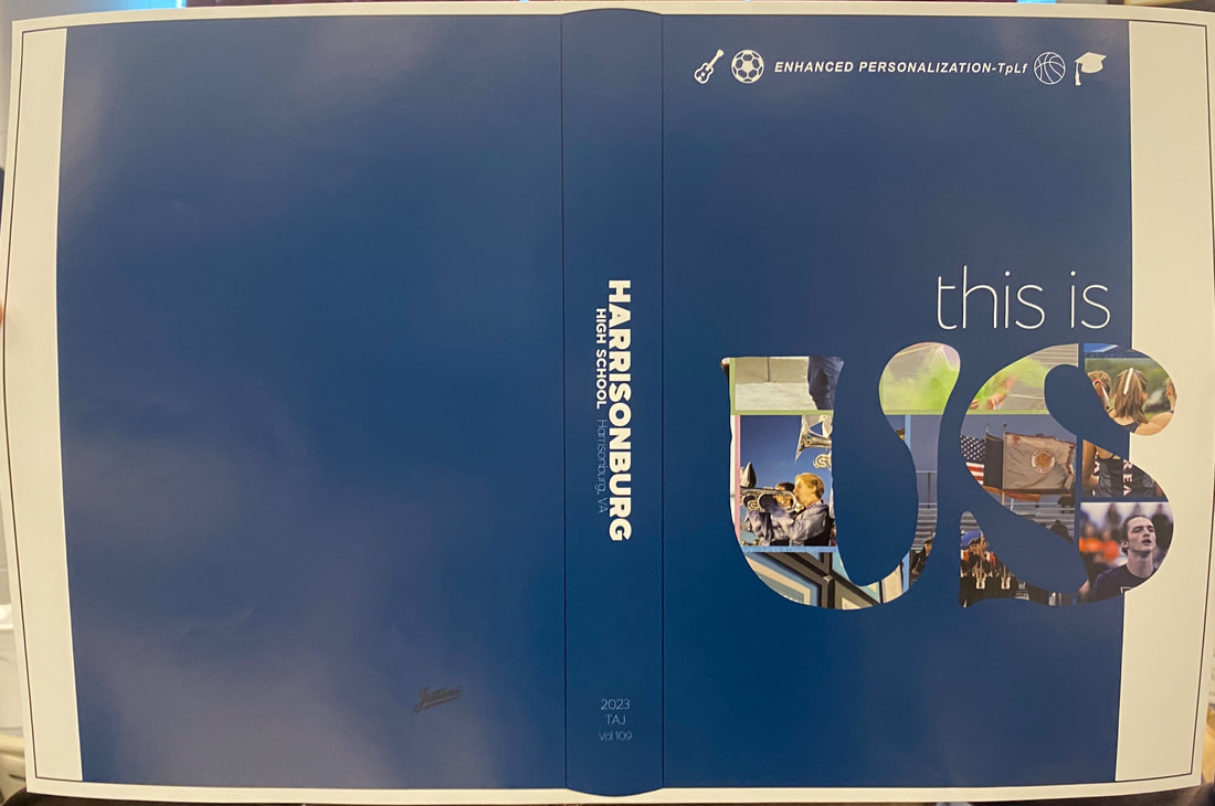
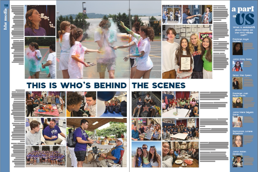
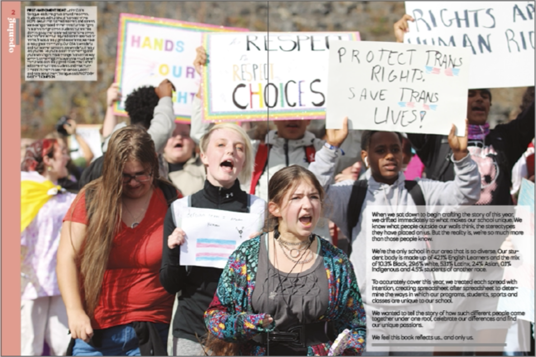
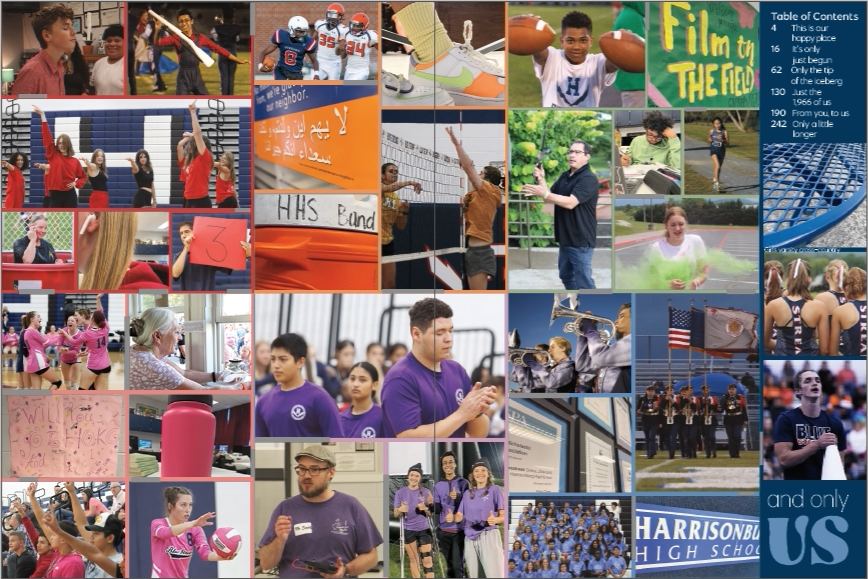
Our theme this year is "This is Us and Only Us," emphasizing the unique aspects of HHS. More on this under the "Commitment to Diversity" tab. We even had yearbook t-shirts designed and ready to go for the first day. 
|


|
2022-23 TAJ Design:
|

|
|
|
This year I really got to use my creativity and make my vision come to life of what the book would turn out like from beginning to end. I was really set on making the book look completely different than last year. One significant difference I see when comparing the past two years is diversity in coverage and amount of coverage. Looking at a 2021-22 spread next to a 2022-23 spread, we have done a significantly better job this year with the amount of pictures on a spread and the amount of people covered per spread. This coincides with our theme of "This is Us and Only Us." On every divider, end-sheet, opening or closing spread, we wanted to emphasize the idea of "This is Us" so each of these spreads includes a picture of many students highlighting a unique part of HHS.
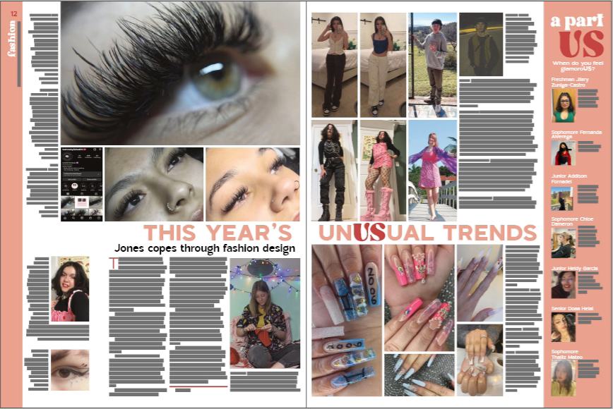
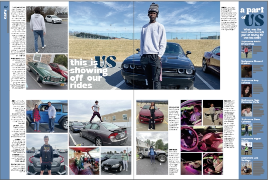
We also really focused on the idea that the book we are creating tells the history of this year. We considered: What are we going to want to look back on in 20 years? What is common to us now that we might think is super odd later in life? By considering these things, we chose spreads such as a political timeline, cars, fashion and shoes. These are all topics my staff thought we would want to look back on.
We also really focused on the idea that the book we are creating tells the history of this year. We considered: What are we going to want to look back on in 20 years? What is common to us now that we might think is super odd later in life? By considering these things, we chose spreads such as a political timeline, cars, fashion and shoes. These are all topics my staff thought we would want to look back on.
CSPA New York 2023 Convention Design Takeaways
|
One of my biggest goals for attending the New York convention this year was to really focus on design sessions. I took one class in particular that stood out to me where he went through the foundations of design and basic rules to follow.
One of my biggest takeaways was the idea that design has a purpose, it isn't just making something "pretty." Our job as designers is to pull the reader in and make their eye move though the way we layout content. |
|
